

Where Is the Alleged Australian Warming?
Where Is the Alleged Australian Warming?
By Geoff Sherrington

LAND SURFACE AIR TEMPERATURE DATA
Where Is the Alleged Australian Warming?
Dingo in the Chook House. Beware!
Geoff Sherrington
Where is the claimed Australian Global Warming?
Where is the fingerprint of Australian Urban Heat Island effect?
Why is there only one Monopolies Commission?
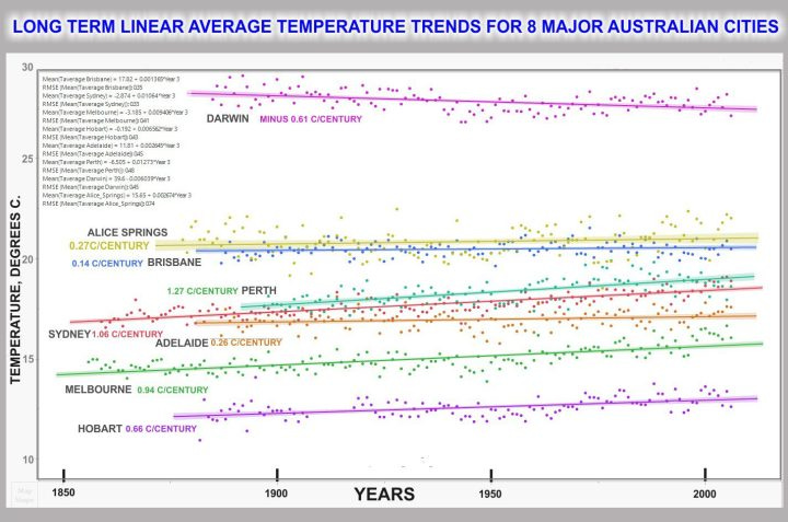
Here is a puzzling picture. (click to enlarge)
Background.
Australia’s Bureau of Meteorology, BOM, released a big data product a decade ago. It showed the historic, daily, observed temperatures as maxima and minima in ⁰C for about 1,650 weather stations.
This is the foundational, raw data on which much climate research is based, for Australian temperatures.
My graph uses a sub-set of these foundational temperatures. It is for the 6 State capital cities, plus Darwin and Alice Springs to get more coverage of the country.
Melbourne 1855 is the oldest start date for the data. Perth, 1897 is the most recent start date. All data end in December 2006, because the finish date for the BOM compilers was April 2007.
As is customary (though I do not like this method) the image above shows linear least squares fits of regression lines, or simply trend lines. Missing data are not infilled. Outliers are not removed. Some stations have only one station number, meaning no large changes to the station location, while others have up to 3 moves large enough to earn new BOM station numbers. See the columns labelled ‘station number’ in the Excel file below.
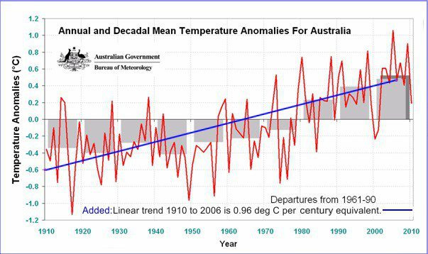
I have downloaded and I acknowledge with thanks, a year 2010 BOM graph of the average annual and decadal temperatures of Australia, with my calculated trend line of 0.96 ⁰C per century equivalent added in blue.
These linear trends in temperatures over time are my main metric here. Trend is used because it should not change greatly with geography. The chosen units of trend are ⁰C per century to allow easy comparisons.
The BOM asserted in 2022 that “Australia’s climate has warmed by an average of 1.47 ± 0.24 °C since national records began in 1910.” That 112 years corrected to 100 years gives a linear trend of 1.31 ⁰C per century equivalent. Source:
http://www.bom.gov.au/state-of-the-climate/
Here are the calculated trends for these 8 cities graphed above, plus all Australia, in units of ⁰C per century but for the century (almost) of 1910 to 2006 incl. The data from 2006 to 2021 indicate higher temperatures than earlier that strongly affect the trend.
Populations today are roughly:
Sydney 5.297m
Melbourne 5.031m
Brisbane 2.628m
Perth 2.224m
Adelaide 1.418m
Hobart 253k
Darwin 150k
Alice Springs 30k
All of Australia 26m
These 8 cities house 70% of Australia’s population.
The original, digital raw data for these 8 cities is in this Excel spreadsheet. It is big. Do give it time to load.
https://www.geoffstuff.com/capital 8 trends long.xlsx
The present station status.
Sydney, Melbourne and Perth have warming trends similar to the all-Australian average. How can this be? Since 5 others show little warming, there must be stations elsewhere in Australia that show even higher warming trends. How can such miscellaneous trends arise from mechanisms that are said to be global, as from a well-mixed gas CO2?
Melbourne. Recently, the old station 86071 was closed in 2015 with a press release about its relocation. “The location at Melbourne Olympic Park represents an improvement in the quality of meteorological observations available and meets international observing standards set out by the World Meteorological Organisation.” The new site 86228, some 2.6 km distant, showed on average to be 0.53 ⁰C cooler than the old one, averaged over a 583-day overlap period starting in June 2013. This difference could, by some ways of analysis, halve the Melbourne warming trend shown in the first graph.
Sydney. The old station was closed in 2022. BOM reported “The Bureau of Meteorology’s official weather observation station for Sydney is moving to a new location at Sydney Observatory Hill. The relocation is due to development plans for the original site”. Colleague Dr Bill Johnston in 2017-8 wrote extensively about Sydney in a report within the following link. He noted that “Site changes have a permanent impact on upper-range extremes and as step-changes in their ratio are significant and result from rainfall and site-changes acting together, it cannot be claimed that upper range temperatures have increased due to changes in the climate.”
sydney-observatory-site-changes-history-extremes-trends-v1.3Download
Perth. The station in Perth city, 9034, begins the data. Data since May, 1992 are from the airport site. Colleague Bob Fernley-Jones (dec’d) reported on Perth adjustments in 2015.
In Darwin, there could be a site difference between the early Post Office station 14016 and the post-1942 airport station 14015. A neutral adjustor might subtract 0.28 ⁰C from all of the first station temperatures, to produce a zero trend outcome to replace the cooling trend.
Adelaide, Brisbane, Alice Springs and Hobart show little change in linear trend over the many decades to 2006.
What does it all mean?
There is no evidence that these simple trends can cause concerns about Australia heating up dangerously.
Alarming trends are absent from the simple, raw data, presented here Therefore, horrifying trends alleged by others can arise only from manipulating, altering or ignoring the foundational data.
Those seeking to use UHI to explain trends should be aware of a prime difficulty. In Australia, the historic data are not suited to such an exercise. They were collected with diligence and curated by the BOM, for which they are thanked. But they were collected for purposes like understanding farming conditions, airport conditions for pilots, local weather etc. They lack the accuracy required for elegant exercises, such as estimating UHI from the subtraction (Turban-Trural) between nearby stations.
The graphs above have RMS error estimates shown, to support that contention.
I have done years of work on these topics, so I have a large collection of analyses as well as this city set of 8 analysed in many ways, even Mahalanobis Distance methodology and bootstrap forests.
I have presented only simple findings here, but I am also well versed about complex findings. Subsequent articles will deal with analysis of 37 “urban” stations and 45 “pristine” stations selected for UHI detection.
The final lesson?
As with all scientific work, researchers are not permitted to rely on convoluted interpretations when the simple, primary data do not tell the required story.
First explain the simple, primary data.
Geoff Sherrington
Scientist, retired, Melbourne.